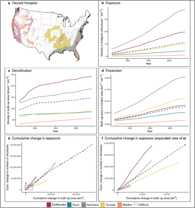
Fig. 1: Several ways to view the pattern of hazards and development in the U.S.
Our recent paper in the AGU journal Earth’s Future (open access) tracks the history of U.S. development in natural hazard zones. You can read also about the study here and check out our AGU poster. This blog digs into some more subtle hazard exposure patterns we uncovered.
It is almost as if hazard zones attract rather than repel development. Using a unique, high-resolution dataset of buildings (homes, offices, factories, schools, libraries, farm buildings, etc. See: Leyk and Uhl 2018) we tracked development in the top 10% most hazardous landscapes in the contiguous United States from 1945 to 2015. We found that the long-term pattern of development has been downright unlucky. Hazard hotspots cover ∼31% of the country (Figure 1a). Yet by 2015, some 57% of structures lay within those danger zones. In 1945, ∼173,000 structures were located in the intersection of at least two hazard hotspots. By 2015, that number was over 1.5 million. These trends are not easily altered. And while growth has slowed a bit in the last two decades, there is no hint that hazard mitigation has affected development, as recent growth continues to preferentially occur in hazard hot spots.
Fig. 1: Several ways to view the pattern of hazards and development in the U.S.
We mapped “hotspots” of occurrence and magnitude of the most damaging hazards---flood, earthquake, hurricane, tornado, and wildfire---over the contiguous U.S. at 250m x 250m grid cells (Fig. 1a). We defined hotspots for each natural hazard as grids where the occurrence or intensity of the hazard exceeded the 90th percentile among all US grids. We then matched this with a unique dataset of over 350 million structures (homes, apartments, shops, offices, etc.) obtained under a data-sharing agreement with the Zillow Group, Inc., to identify where people live, work and recreate, and track trends in development from 1945 thru 2015.
Besides figuring out how U.S. development trends interact with hazardousness (we found that development preferentially lands in hazard hotspots for some reason!), we wondered how the geographical pattern of hazard themselves would intersect with different development trends. For example, we found that densification of already built-up areas dominated earthquake exposure growth (Fig. 1c), as the at-risk west coast cities grew, while expansion drove hurricane exposure (Fig. 1d), as the southeastern coastal plain suburbanized. Expansion also, logically, grew tornado exposure---splaying more development across the tornado-scape just made each tornado more likely to hit buildings (as described in the concept of the “#expanding bullseye”; see Strader et al. 2017).
Bear with us as we dive into some subtleties that we think are important, and dis-entangle some of the messages from our complex graphs. Keep in mind that, over time, new development can fit in among already developed areas (densification) as well as spread to new landscapes (expansion). Simultaneously, some less densely developed places, like rural zones, will become more like suburbs, and some suburbs will densify into cities over the time period we study (1945-2015). Finally, nodes of low-density development (e.g., small towns in otherwise rural landscapes) can also grow and densify. So, our hazard-by-hazard graphs depict all this by plotting exposure in each hazard’s hot spots by: overall exposure, density changes by densification and by expansion, and finally cumulative comparison of density and change of total developed area. Plots of densification and expansion especially reflect this pattern as some developed pixels in, say, intermediate densities make a “phase change” into dense, more urban development. This is especially evident in most of the densification (panel c) graphs for each hazard in our formal paper (see the online open access paper for all the figures), but here we’ll look specifically at the Tornado hazard (Fig. 2).
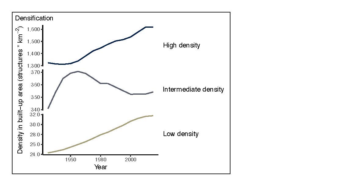
Fig. 2: Structure density trends in each of the three built-up land classes, from rural to urban, in the tornado hotspots.
Keep in mind that the graph shows density of built-up area for three classes of development: high, medium and low density. Before about 1960 these southern and Midwestern cities were slowly losing some density, and then the downtowns became more attractive to high-rise development and density increased thru the end of the record. At the intermediate density, however, the rate of densification actually reversed, as suburbanization spread out development. This is part of what caught the attention of Strader and his colleagues as they studied the growing “bullseye” that development presented to the essentially random pattern of tornado tracks. Development in the hurricane hazard hotspots (Fig. 3) tells a slightly different story, as the relatively less dense downtowns remain more low-rise, more like the suburbs. The big surprise in our study was the pattern in the wildfire hotpots, as discussed below.
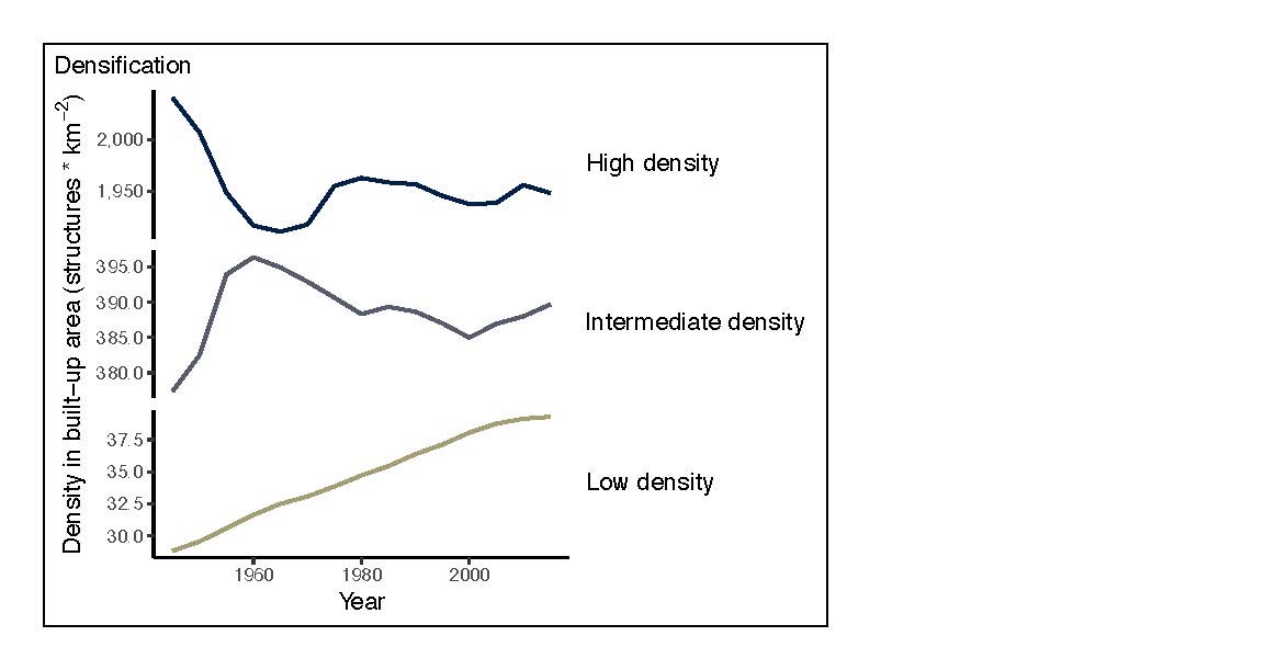
Figure 3: Structure density trends in each of the three built-up land classes, from rural to urban, in the hurricane hotspots.
Besides the larger patterns described in our article, we see some hints of emerging patterns, some negative some actually positive. Further deeper dive into high-resolution development data is needed to diagnose these trends.
It is no surprise that development in the wildfire hotspots is dominated by low (and some intermediate) density development (Fig. 4), but the small sliver of high-density land use that thickens in the last couple of decades is worrisome. Fire managers might not be surprised by this, reflecting on fires like the Tunnel (Oakland, CA), Waldo Canyon (Colorado Springs, CO), Cerro Grande (Los Alamos, NM), and Camp (Paradise, CA) that burned right into dense residential and commercial land uses, destroying hundreds or even thousands of buildings in a day. Just last year (2020) we here in Colorado watched as the East Troublesome fire burned (during a nocturnal run) through a golf course community on the edge of Grand Lake, CO. This reminds us that not only do cities expand through suburban expansion, but nodes of development also perforate more rural landscapes (e.g., resort towns in the American West), and these present almost urban-like densities. When this expanding urban fringe intersects with wildlands, it creates a dynamic and growing fire risk. Just like for any other hazard, expansion into fire hotspots increases the number of homes in harm’s way. What’s notable about this type of expansion is that it also introduces human-related ignitions and fuel into flammable landscapes, thus increasing the fire hazard itself. This two-way interaction between the built-environment and fire hazard against a backdrop of climate change is one of the main causes of the worsening fire crisis in the American West.
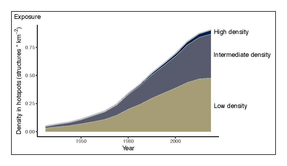
Fig. 4: The small increase in high density development in the wildfire hotspots raises worries about the future impacts of worsening wildfire regime in the U.S.
Trends in flood zone development reflect the complex history of where cities were founded (e.g., along coastlines and rivers), how cities have grown spatially, and what cities have done to protect themselves from floods (especially levees and bypasses, as we examine in the Sacramento Valley case in the Earth’s Future paper). The linear nature of rivers begs the question as to whether risk along floodplains may be decreasing simply due to the typical geography of urban growth, namely radial growth outward from urban cores. However, in opposition to this geometrical reduction of risk is the so-called ‘levee effect.’ Theory suggests that physical flood protections against an arbitrary flood frequency like the 100-year event may actually worsen the losses that occur during the 500-year or 1,000-year events because hazardous floodplains are increasingly developed in response to flood protection. Given that the ‘expected damage’ is calculated as the probability times loss, the general expectation is that losses will decline at larger return periods (lower annual probability). However, if the induced growth behind levees outstrips the discount associated with these lower frequency events, then protection may actually increase expected losses! We and others think this might be showing up in development patterns along the Sacramento Valley, but we are a long way from nailing down how significant and how widespread the levee effect is more generally.
Leyk, S., & Uhl, J. (2018). HISDAC-US, historical settlement data compilation for the conterminous United States over 200 years. Scientific Data, 5(1), 180175. https://doi.org/10.1038/sdata.2018.175
Strader, S. M., Ashley, W. S., Pingel, T. J., & Krmenec, A. J. (2017). Observed and projected changes in United states tornado exposure. Weather, Climate, and Society, 9(2), 109–123. https://doi.org/10.1175/WCAS-D-16-0041.1