Air Quality Data and Transportation-Related Emissions
Air Quality Data and Transportation-Related Emissions: Changes over time and COVID-related trends in the Denver, CO region
Significance and Issue
Vehicle transportation contributes to air pollution, poor air quality, greenhouse gases, health concerns, and impacts to quality of life for citizens. Denver is unique because the geographic location of the city, at the foot of the Rocky Mountains, creates a temperature inversion. A temperature inversion traps pollutants near the ground, leading to poor air quality.
Background: Air Quality in Denver

Denver has had issues with air quality since the 1960s. In the 70s and early 80s, Denver would break air quality standards for 200 days a year. However, in 1970 the Clean Air Act was passed which required regulations of all sources of air emissions, which greatly improved the air quality in Denver. The city improved air quality standards for all pollutants except ozone (O3). This has recently caused Denver to be reclassified from "Moderate" to "Serious Nonattainment" because of the high levels of O3.
AQI (Air Quality Index) is now regularly measured by the Environmental Protection Agency (EPA) by regulating five main pollutants:
- Ozone (O3)
- Particulate Matter (PM 2.5 & 10)
- Carbon Monoxide (CO)
- Sulfur Dioxide (SO2)
- Nitrogen Dioxide (NO2)
AQI tells us on a scale of 0 - 500 the level of air pollution and the greater AQI, the greater the health concern. Our research examined O3, PM, and NO2 and their influence on air quality, asking if there was any potential decrease due to COVID-19 and the reduction of commuting in 2020, and what alternatives we may have to single-occupancy vehicle (SOV) travel.
Approach to the research
Research Questions:
- How have transportation emissions changed over time in Denver?
- What factors affect transportation emissions changes in the region? (i.e. COVID - 19)
- What are transportation alternatives to single occupancy vehicles?
In the pursuit of understanding the effects that vehicle miles traveled (VMT) and car emissions have on Colorado’s air quality, we explored a multitude of air quality data pertaining specifically to Colorado and its various counties for trends and changes over time and space. In our efforts, we researched transportation-related pollutants and the history of air quality in the Colorado region, as well as compared transportation-related criteria pollutants to see changes over time and space. Furthermore, in our research, we focused on comparing 2019 and 2020 data to see the impact COVID-19 restrictions had on the criteria pollutants, as well as, the AQI. We carried out our research by using python to read the files and used matplotlib to plot the data. Additionally, we researched and found data for alternative transportation such as bike paths and RTD routes and stops to better inform stakeholders. Furthermore, we used Python to read and display files using geopandas. The majority of our data came from free downloads on the EPA website, Denver Open Data Catalog, RTD Open GIS Data and Colorado Department of Transportation.
Annual Air Quality Index (AQI)
In order to analyze air quality trends for changes over time and space, we used the core based statistical area data of Denver, Aurora, and Lakewood provided by the EPA. After downloading the csv files where the data is stored, we opened the csv file using pandas. We then subsetted the Denver-Aurora-Lakewood county for both 2019 and 2020.
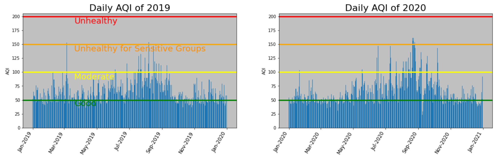
In alignment with our prediction, we found that there were a total of 274 days in 2019 that exceeded “Good” on the Air Quality Index whereas in 2020, there were only 247 days that exceeded “Good”. When put into perspective, 2019 had 27 more days of poorer air quality than 2020 -- that’s almost an entire month!
After creating the daily AQI plots, we added different colored horizontal lines to mark the four air quality thresholds at 50, 100, 150 and 200 for good, moderate, unhealthy for sensitive groups, and unhealthy. We then coded to annotate the horizontal line using the (x,y) coordinate system to place the annotation on the graph.
#Create horizontal line

ax1.axhline(50, color = "green", linewidth ="3")

ax1.axhline(100, color= "yellow", linewidth ="3")

ax1.axhline(150, color= "orange", linewidth ="3")

ax1.axhline(200, color = "red", linewidth ="3")

ax1.set_facecolor('silver')


#Annotate horizontal line

ax1.annotate("Good", xy=[pd.Timestamp ("2019-03-20"),39],fontsize = "20", color="green")

ax1.annotate("Moderate", xy=[pd.Timestamp ("2019-03-20"),87],fontsize = "20", color="yellow")

ax1.annotate("Unhealthy for Sensitive Groups", xy=[pd.Timestamp ("2019-03-20"),137],fontsize = "20", color="darkorange")

ax1.annotate("Unhealthy", xy=[pd.Timestamp ("2019-03-20"),187], fontsize = "20", color="red")
As you can see on both graphs, there is a great spike in the late summer months of August and September. In order to see if the AQI really improved during the pandemic before the fire season began, we parsed out the months of March, April, and May of both 2019 and 2020. The data revealed that there were 66 days in 2019 that exceeded “Good” whereas 2020 only had 53 days that exceeded good.
While there are many factors that contribute to an increase in the Air Quality Index such as forest fires, rising temperatures, and industrial factories, the decrease of cars on the road due to the pandemic restrictions likely contributed to the better air quality in the spring of 2020.
County AQI Map
Initially the group wanted to see if there was any quantifiable data showing the connection between poorer air quality and urban areas. This county map was combined to a data set of AQI data for 2020 using a table join. Next, a line of code was introduced adding all of the columns with an AQI over 100 to create a new column with the totals. These totals were added to the counties as labels over a red color map with darker colors showing more days per year exceeding 100 which is unhealthy for sensitive groups. The higher numbers and darker colors align with the major metropolitan counties of Colorado's Front Range. Jefferson County, which includes the majority of west metro Denver, led the state in 2020 with 27 days of unhealthy air followed by Boulder County at 21. Residents of Jefferson County see almost an entire month of poorer air quality in a year than those living near Aspen in Pitkin County. Since labeling in Python is trickier than it should be, a simple for i statement reads the column and places the result in the center of the polygon as a label.

#Create a column that totals all numbers for AQI 100 and higher:

sum_column = join["Unhealthy for Sensitive Groups Days"] + join["Unhealthy Days"] + join["Very Unhealthy Days"]

join["Unhealthy"]=sum_column

#Create labels from new data column "Unhealthy" & display on county polygons:

for i in range(len(join)):

  plt.text(float(join.geometry.centroid.x[i]), float(join.geometry.centroid.y[i]),

           join.Unhealthy[i], size=22, color="black")
Traffic Counts Map
The Colorado Department of Transportation (CDOT) maintains data of traffic counts on various segments of highways throughout the state. This map is current until the final week of July 2021 and was another way the group used downloadable data to display differences in vehicle density in both urban and rural settings. Sections of Interstate 25 in Denver approach nearly 300,000 vehicles per day with most high-density traffic areas in the metropolitan areas of the Front Range or Interstate 25 or 70. The map also displays the high volume of traffic along the I-25, I-70 and I-76 corridors throughout the state which are vital to Colorado’s commercial and tourism industries. Traffic count density is plotted as average annual daily traffic (AADT) in Python. The AADT count totals are classified as a color map showing darker areas with more traffic. To use the classify function on spatial data install the mapclassify package, set scheme to the appropriate setting in this case “percentiles.” The numerical results defaulted to decimal readings which were bulky for presentation so code was created to round the traffic totals to integers, move, resize and recolor the legend on the map.

#install mapclassify

%pip install mapclassify

import mapclassify

#Set appropriate scheme and colors for variable:

hwy_traffic_counts.plot(scheme='percentiles',

                          legend = True,

                            column = "AADT",

                          cmap= 'hot_r',

                          linewidth=2.9,

                           ax=ax)

#Move legend

leg = ax.get_legend()

leg.set_bbox_to_anchor((.96,0.315))#adjust settings to find best location

#Remove decimals from legend, make integers

for lbl in leg.get_texts():

    label_text = lbl.get_text()

    print(label_text)

    lower = label_text.split()[0][:-1]

    upper = label_text.split()[1]

    new_text = f'{float(lower):,.0f} - {float(upper):,.0f}'

    lbl.set_text(new_text)

    lbl.set_fontsize(18) #sets legend font size

#set legend color

leg.get_frame().set_facecolor('C0')
Transportation-related “criteria pollutants”
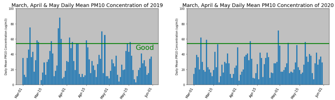
Members of the group analyzed data for individual pollutants to see if less traffic during the 2020 pandemic led to a reduction in air pollution. Since air quality data uses several criteria and pollutants, those most indicative of vehicle emissions were chosen for the project. The biggest drop in traffic counts was during March 2020 and various “criteria pollutants” were compared to similar spring months in 2019.
PM 2.5 and 10
Particulate matter (PM) which consists of fine particles and water vapor in the air is measured at 2.5 and 10 micrometers. Sources of PM are gasoline and diesel emissions, dust and debris from fields or construction, power plant emissions and fires. Elevated levels of PM in breathing air affect people with various respiratory conditions and contribute to the creation of Ozone. In 2019 Denver area PM10 levels went above good 14 times while 2020 saw only seven during March, April and May months.
NO2
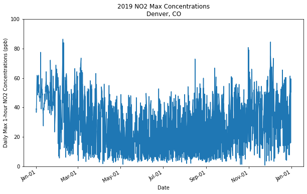
Another transportation related criteria pollutant compared was Nitrogen Dioxide (NO2). Nitrogen Dioxide enters the air from burning fuels and reacts with other Nitrogen Oxides (NOx) and other airborne chemicals to create particulate matter and ozone. Here we plotted similar graphs of spring months in 2020 versus 2019 and saw a slight reduction in NO2 levels during this time.
The NO2 dataset was extremely dense and not very clear, we knew it would be difficult to spot and highlight patterns or trends using this data alone. The image below is an example of what one year of data looked like using matplotlib.
To make this information more digestible, we chose to parse the dates and show the pollutant levels from March to May in both 2019 and 2020. This would show us if there were any changes in transportation related pollutants during the COVID-19 lockdown. We then plotted the data side-by-side and used a bar graph in order to better compare and analyze.
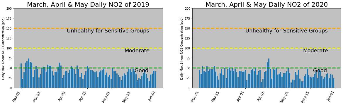
Although these graphs are clear and comprehensible, it would be naive to expect to define a trend without looking at the numbers. We used the code below to find the statistics (i.e. mean) and to count the sum of total days above the “good” threshold. In this case, the threshold was 50 ppb.
no2_spring_2019.describe()

no2_spring_2020.describe()

(no2_spring_2019["Daily Max 1-hour NO2 Concentration"]>50).sum()

(no2_spring_2020["Daily Max 1-hour NO2 Concentration"]>50).sum()
We found that the mean for 2019 and 2020 were 29.19 ppb and 25.19 ppb, respectively. Although that is not a major change, we can see there was a notable drop in overall NO2 concentrations. We see this emphasized when we look at the count for days above 50 ppb. In 2019 there were 42 days above 50ppm, while in 2020 there were only 12.
Ozone
In recent decades, Colorado’s transportation industry has taken various measures to help improve the air quality in the region including commuter rail and bus systems, bike, carpool and toll lanes and requiring single-occupancy vehicles to meet emission standards every two years. Yet with steady increases in population bringing more vehicles to the roads combined with annual temperature increases there are serious challenges to obtaining cleaner, breathable air in the region. While slight improvements in some air quality indicators in 2020 can be seen as a positive, evaluation of ozone levels show the opposite: significant increases in a short period of time.
Ozone is not emitted but created in the air when Nitrogen Dioxides react with Volatile Organic Compounds (VOCs), particulate matter and heat or sunlight. Main contributors to ozone are vehicle exhaust, industrial sites, power plant emissions and fuel vapors.
Ozone becomes more of a threat during the summer months because of higher temperatures so for plotting ozone we used the months of June, July and August, typically the hottest of the year.
As our project began we noted some news articles stating Denver had seen a significant increase in ozone levels in the past few years. Here we plotted the Welby site in North Denver during the summer months and saw a significant increase in Ozone levels from the previous year. 2019 showed 10 days worse than good and no days above moderate. 2020 saw almost 4 times as many at 37 days worse than good and 4 days above moderate. The average increased from .05 to 0.57 parts per million.

Since this trend was alarming, we decided to continue one step further and plot the data for this Ozone season 2021. In the first 58 days of this summer, data not including the month of August 2021 has already seen 42 days worse than good and 13 in the moderate range. The .064 parts per million ozone concentration is almost 30% higher than just two summers ago.
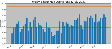
In recent weeks Denver has some of the worst air quality in the US and top ten worst air quality for major cities in the world. While true out of state wildfires contribute to Denver’s poor air, the elevated Ozone levels are mainly due to Denver’s unique weather patterns, summer temps above 85 degrees F, and the rapidly increasing population which brings more vehicles to Colorado’s roads and highways.
Colorado’s motorists may have seen billboards on Ozone alert days asking them to skip drives, mow lawns and fuel vehicles after 5 pm when the daytime heat begins to fade. The Metro Denver area has a robust public transportation system including light rail and bus, and requires vehicles to be emission tested every two years. Yet the steady increases in population and temperature creates enormous challenges for clean, breathable air in Denver and the Front Range.
As our project evolved, we decided it was important to create awareness and inform others about the Air Quality Index, individual pollutants, and ozone alert days because of our findings. AQI is now featured on most smartphone weather apps and in the Denver area, is something that is now frequently talked about. We also hope to inform and empower others to seek alternative transportation methods.
Alternative Transportation Map
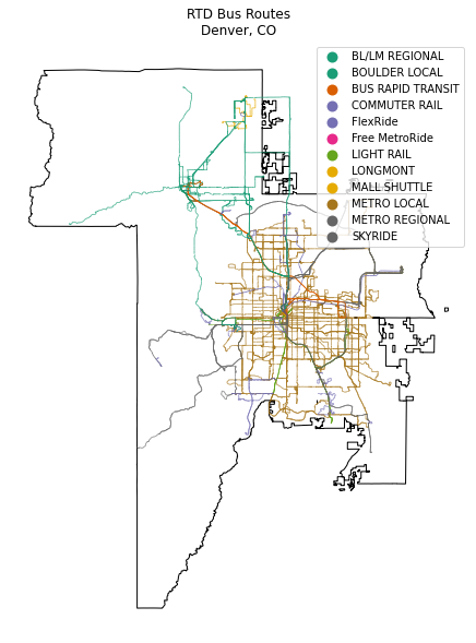
Here we have a map showing the different Regional Transportation District (RTD), the Denver metro region’s public transit agency, services available in the metro area. The black outlines the RTD boundary, and the bus routes are color coded using cmap. Each color correlates with a different type of service available specified in the column named “SERVICE” in the RTD bus routes shapefile.
We wanted to do more with this map and make it more accessible and user friendly, so we put the bus route and light rail shapefiles onto an interactive folium map. The reason we chose to use lightrail stops instead of bus stops was because there are over 8,000 bus stops, which made the map extremely cluttered and hard to read as well as slowing down processing time. We created this map using the code below:
# Interactive Map with Lightrail Stations

# import library needed

import folium

# Define coordinates of where we want to center our map

map_center_coords = [39.7392, -104.9903]


# Create the map

my_map = folium.Map(location = map_center_coords, zoom_start = 9)

my_map


# Add data

lrstops = lightrail_stops_shp

busroutes = rtd_busroutes_shp


for i, coords in enumerate(zip(lrstops.geometry.y, lrstops.geometry.x)):

    folium.Marker(

        location=[coords[0], coords[1]],

        popup = lrstops["NAME"].values[i]

    ).add_to(my_map)


busroutes_json = rtd_busroutes_shp.to_json()

style = {'color': 'black'}


lines = folium.features.GeoJson(

    busroutes_json, style_function=lambda x: style)

my_map.add_child(lines)


my_map

This map allows the user to zoom in and out to their liking, and the blue markers each represent a lightrail stop. When you click on the markers it will tell you what stop/station you are looking at.
Bike paths and trails
Additionally, there are over 196 miles of on-street bike paths and facilities. With plans to add 270 more miles of high comfort bikeways. There are many initiatives to encourage cycling especially to those who commute downtown. Coffee and commutes allows riders who live within the seven bicycle corridors to meet at a local coffee shop and be led by a guide through the accessible routes downtown. They want to encourage residents who commute by car to consider cycling instead. Future mapping efforts could include a bike path and trail map along with the transit map to show multiple forms of alternative transportation in one map.
Summary and Conclusions
We were able to conclude that there was a decrease in overall AQI levels above good during the months of March, April, and May in 2020 compared to 2019. With our analysis in the evaluation of particulate matter (PM) and NO2, we were able to conclude that the number of days the levels of these pollutants were moderate or worse went down from 2019 to 2020.
|
|
|
|
|
|
|
|
|
|
|
|
|
|
|
|
We also considered a separate analysis of ozone levels in summer months of 2020 compared to levels in 2019 and 2021, specifically to see what impact stay-at-home mandates possibly had on these levels. Overall, other factors outside of reduced traffic likely impacted higher summer ozone levels in 2020 and 2021, including high temperatures, wildfires, and drought.
|
|
|
|
|
|
|
|
|
|
|
|
|
|
Areas for future research
Future areas of research include plotting time-series data to display a greater span of 5-10 years. We can also subset the locations of air quality monitoring sites to see regional effects and to show disparities in marginalized communities.
We discussed creating a dashboard that would allow residents to input parameters such as vehicle type and expected travel distance that would allow them to consider alternative transportation based on the AQI that day. Electric vehicle sales have increased (worldwide) according to the International Energy Agency. We would like to see how this trend impacts the Denver Metro area. Denver is expected to add 145k more residents by 2035, so we will need to analyze this impact as well. Until policies are implemented to reduce emissions, or employers provide more incentives to encourage their employees to use alternative transport, the onus is on us as individuals to consider changing our transportation habits to reduce our use of single occupancy vehicles.
Sources:
BusRoutes. RTD GIS Open Data Download. (2019, December 30). https://gis-rtd-denver.opendata.arcgis.com/datasets/e14366d810644a3c95a4f3770799bd54_4/about
Black, William. (2010). Sustainable Transportation: Problems and Solutions. Guilford Press: NY, NY.
Colorado Highway Counts, Colorado Department of Transportation. https://data-cdot.opendata.arcgis.com/datasets/highways-traffic-counts-1/explore?location=38.903412%C-105.579450%C6.99
Colo County Boundaries: https://www.coloradoview.org/colorado-gis
Denver's Brown CLOUD: Science experiment. The Lab. (2015, September 7). https://www.stevespanglerscience.com/lab/experiments/denvers-brown-cloud/.
NASA. (2021, August 3). A rising problem. NASA. https://earthdata.nasa.gov/learn/sensing-our-planet/a-rising-problem.
Environmental Protection Agency. (2019). Our Nation's Air. EPA. https://gispub.epa.gov/air/trendsreport/2019/#air_pollution.
Environmental Protection Agency. (2021, June 7). Basic Information about NO2. EPA. https://www.epa.gov/no2-pollution/basic-information-about-no2#Effects.
LightrailStations. RTD GIS Open Data Download. (2020, December 30). https://gis-rtd-denver.opendata.arcgis.com/datasets/e14366d810644a3c95a4f3770799bd54_1/explore?location=39.806875%2C-105.095031%2C9.73
Rtdboundary. RTD GIS Open Data Download. (2020, February 24). https://gis-rtd-denver.opendata.arcgis.com/datasets/674d164b39694c79849b7c19465077ba_0/about.
IEA IEA (2021), Global EV Outlook 2021, IEA, Paris https://www.iea.org/reports/global-ev-outlook-2021
https://www.bicyclecolorado.org/initiatives/abcs/