Denver Water Supply: Snowfall, Precip + Reservoir Levels
Correlation between Snowfall, Precipitation and Reservoir Levels in the Denver Water Supply
Correlation between Snowfall, Precipitation and Reservoir Levels in the Denver Water Supply
Project By MSU Denver Team
EDSC Interns:
Naomi Jacquez: Biology
Lola Johnson-Hagmoc: Sociology
Emma Haupt: Environmental Engineering
Brandon Holt: Environmental Science
Emily Straut: Environmental Science
Project Mentors:
Aaron Doherty: Advanced Intern, Geospatial Sciences
Dr. David Parr: Instructor of Geographic Information Sciences at MSU Denver
Introduction
Background
The city of Denver and many surrounding suburbs in the metro area get their municipal water supply from Denver Water, a public utility company. Denver Water sources its water mainly from Western Colorado (the part of Colorado west of the Continental Divide) as snowfall and precipitation are much greater there (representing 80% of Colorado’s total annual precipitation). The sourcing of water mainly from snowmelt necessitates the use of reservoirs to store water to be available for municipal use year-round. Climate change has greatly impacted the water supply to Denver Water in a multitude of ways including reduced annual precipitation rates (most notably snowfall), and an increased loss of water stored in reservoirs caused by evaporation.
Significance and Issue
With a growing population in the Denver metro area, coupled with the effects of climate change on the region, a multitude of issues have presented themselves in sourcing water for a growing region, that year after year is becoming more prone to drought. As the effects of climate change grow more severe in both the present day and the future, the prospects of a stable water supply become less certain. According to the study, published in the Proceedings of the National Academy of Sciences: "Water resources will become more difficult to predict in the Northern Hemisphere’s snow-dominated regions later this century due to the impacts of climate change...As snow accumulation recedes and fails to generate reliable runoff, the amount and timing of water resources in areas such as the Rocky Mountains will increasingly depend on rainfall."
Approach to the Research
Research Question
How does decreasing precipitation and declining snowpack due to climate change across the mountain regions affect the Denver water supply?
Research focuses on four reservoirs that supply water to Denver Water: Antero, Dillion, Cheseman, and Gross. Using historical data sourced from our meetings with Denver Water, we are looking to prove a correlation between snowfall amounts and available water supply. This relationship is represented by snow coverage data and reservoir levels. We will be comparing this data between times of drought, and selected periods of time to examine and prove the effects of climate change on municipal water supply.
Methods: Graphs, Maps, and Code Snippets
Reservoir Data
In order to determine the correlation between reservoir levels and precipitation we gathered data about the reservoirs primarily from Denver Water. We communicated with several representatives from the public utility to request data for reservoirs that are representative of the different collection systems. For each reservoir we were interested in their monthly average elevation in feet above sea level and storage in acre-feet. In addition we totaled the precipitation in inches by month and year for different comparisons. Initially we graphed both elevation and storage data for the reservoirs but determined that storage in acre-feet was a better measure of the reservoirs.

As a group we choose to look at reservoirs in the three different collection systems for Denver Water. The four include Dillon Reservoir from the Western Slope Collection System which is tunneled through the continental divide, Gross Reservoir from the Moffat System in the north, and Cheesman Reservoir and Antero Reservoir from the South Platte Collection System. It is important to note that Antero is a drought storage reservoir so it typically remains full except in times of drought when the city needs to tap into its resources.
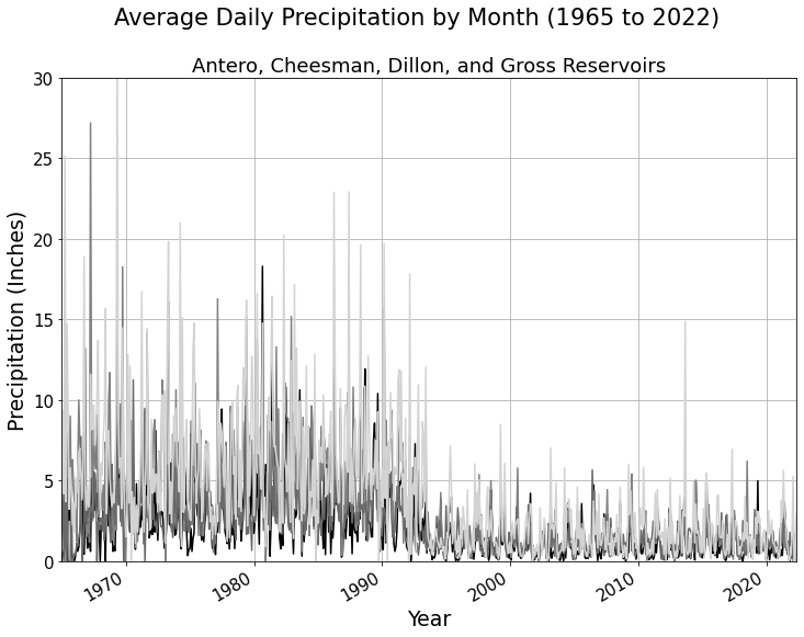
The first step with the data was to write code to plot the precipitation using matplotlib in Python and we graphed the precipitation from 1965 to 2022 at each reservoir location on the same graph. After doing so we noticed a major change in precipitation amounts at the reservoirs in the mid-1990s. See the figure titled Average Daily Precipitation by Month (1965 to 2022) for reference.
Below is the code written for the precipitation graph. The process we used was to read in the .csv files from Google Collab and set them to a variable called reservoir_data_date for each reservoir. From there we used matplotlib to create a line graph of the data for storage, elevation, and precipitation. There are comments in the code snippet below showing what is going on with each function.

Next, we graphed reservoir storage and precipitation together in one chart for each reservoir to look for correlation and decided to focus first on the decade from 2000-2010 since Denver Water told us about the drought starting in that time. We used a dual y-axis plot to show how full the reservoirs are by how full their storage capacity is, with the darker line, and the precipitation in inches, with the lighter line. There is annual fluctuation in how full the reservoirs with the spring to summer snowpack melt out and precipitation. Each graph follows the same scale with 100% being the maximum storage capacity for each reservoir. Occasionally, however, some reservoirs have the tendency to fill beyond capacity at flood state. The Antero graph is plotted with a dashed line style since it is a drought storage reservoir and therefore functions a little differently than the other three reservoirs.
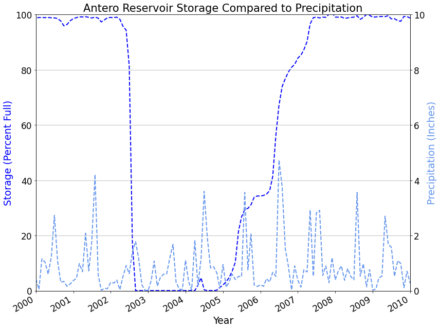
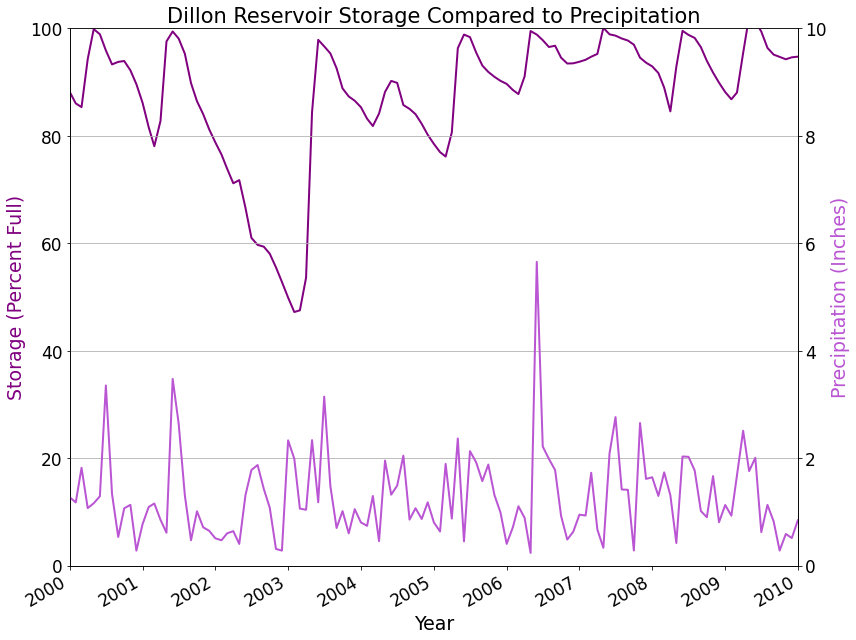

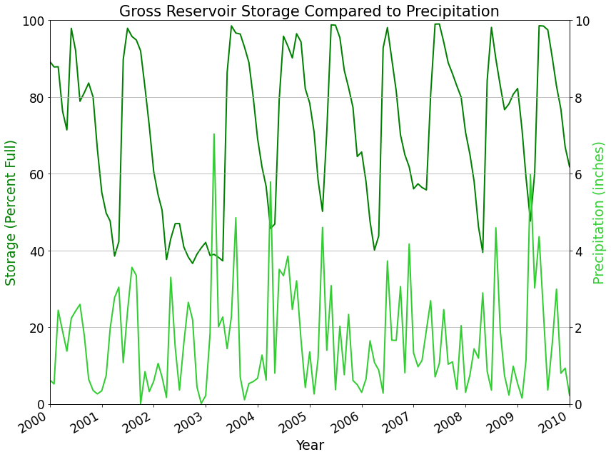
By plotting the graphs we could see trends with the precipitation and reservoir storage. All four reservoirs dropped far below their normal capacity when the monthly precipitation was less than normal and the reservoirs rebounded after a period of more rain. This observation led us to calculate correlation between precipitation specifically and reservoir storage. The results were inconclusive and resulted in a pretty low r value which means there was relatively little correlation when looking at the data by month. Instead, we followed the same process with total annual precipitation, total snowfall, and average annual storage of each reservoir.
After seeing the data visually with the graphs we calculated the correlation between storage and precipitation by monthly averages. Most of the reservoirs showed little to no correlation with r values between .3 and -.3 which essentially means there is not a correlation. Then we put the data together for yearly storage averages and total annual precipitation and snowfall and from there saw that Cheesman had an r value of .588 and shows strong correlation between storage and precipitation.
Shapefiles
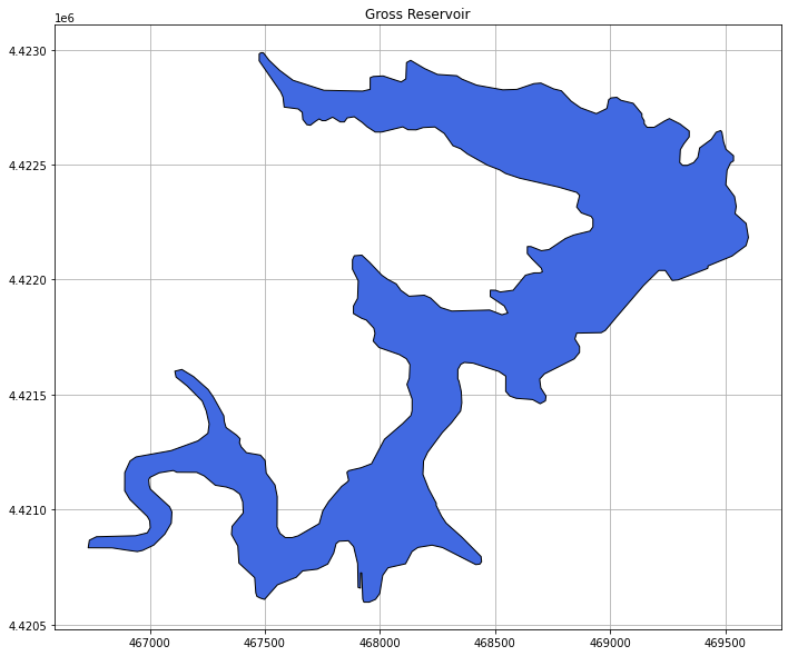
We used a dataset that was created and published by the Colorado Department of Transportation (CDOT), however we accessed it via the University of Colorado Boulder’s GeoLibrary online. The features in this dataset represent areal bodies of water (i.e. lakes, reservoirs, wide rivers, etc.). After downloading the original shapefile from CU Boulder’s GeoLibrary, we were able to create four individual shapefiles (using Geopandas and Matplotlib) for the reservoirs that we wanted to analyze.
When we first accessed this data through Google Colab, there were thousands of polygons. We wanted to focus on four particular reservoirs, so we subset the data to feature the Antero, Dillon, Cheesman, and Gross reservoirs.

After subsetting the data, we plotted each body of water individually using matplotlib.pyplot. This allowed us to view the polygons (reservoirs) on gridded axes.
These shapefiles were overlaid on top of the DEM mosaic image in order to better understand how the precipitation and snowfall that the bodies of water received might be impacted by their elevation.

Raster images/Reservoir DEM Mosaic
Accurate visual representation was necessary to tie in the correlations between snow pack, precipitation, and elevation data. Accomplishing this was a tedious task in python but we started with downloading the raster DEM - satellite images that are taken to represent elevation, streams and rivers in a given area- from the USGS website through national map. From there we were able to load each image up individually. However, this was an inadequate representation of the elevation for the 4 reservoirs we were using in our project which were Dilon, Antero, Gross, and the Cheeseman. A mosaic of the four images was needed, this is where we combined all four images to create one large image that covered the area without any misrepresentation or scattered boundaries. Below is the initial part of the notebook where we started using code to create the mosaic image:


After we got the mosaic plotted and imported, things started to get complicated because the file was almost 2GB and was made as an array image not a tif. We then had to resample it into a smaller (400MB) tif file to reupload it and plot a hillshade out of it. Unfortunately while figuring all this out all at once. we discovered that the files weren’t plotting in the correct projection because we were lacking certain rows and columns that placed them correctly on the map. Once we got the codes to put everything in the correct projection, we were able to get a plot of the mosaic in hillshade. Though this was a breakthrough, the files were so big that they kept crashing our notebooks. Due to time constraints, we decided to plot the rest of the master map in ArcGisPro because adding more layers to the map would take far less time and create a more accurate visual representation for the research. The new layers with the shapefiles of the reservoirs and their watersheds were created and were added to the map. Labels and cartographic details were added to make sure the specifics were highlighted such as the cities, elevation, and size of each watershed. To the right is the final master map with the lines representing the four images that needed to be mosaiced (but this image is the mosaic; the lines are just a representation of where the images were separated at first) that represents all these attributes that tie our data together visually. The bold outline is the state of Colorado boundary to give a comparison as to how big the mosaic image really was.

Calculating Snowfall in the Watershed
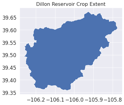
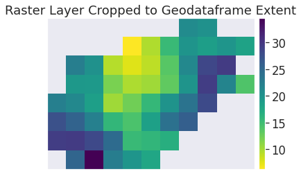
We sourced data from the National Operational Hydrologic Remote Sensing Center which has daily, monthly, and seasonal raster .tif files of snowfall accumulation that goes back to 2008. The goal was to find snowfall data that we could use to calculate the amount of snowfall volume for each reservoir. To map the watershed boundaries, we used ArcGIS Pro and tested it on the Dillon Reservoir watershed for the month of October in 2021 which mapped 426,754,575 cubic meters of snowfall volume. Figure 1 is the watershed shapefile being plotted while figure 2 is the raster image that maps average snowfall accumulation in inches with each pixel representing an area of 1km by 1km.
Having a plethora of data files to work with, we created a looping function to download the snow cover raster data automatically. Due to the format of the URL for each data file, we had to make sure that our looping function addressed this so that it downloaded each subsequent file without failing, which happened a couple of times. We also had to ensure that the previous data files’ inches and volumes values weren’t getting added to the output of the succeeding data file. Lastly, we appended the output of the files into a format that we could use to correlate with our precipitation and reservoir water level data.
Having a plethora of data files to work with, we created a looping function to download the snow cover raster data automatically. Due to the format of the URL for each data file, we had to make sure that our looping function addressed this so that it downloaded each subsequent file without failing, which happened a couple of times. We also had to ensure that the previous data files’ inches and volumes values weren’t getting added to the output of the succeeding data file. Lastly, we appended the output of the files into a format that we could use to correlate with our precipitation and reservoir water level data.
Our next step was to process the monthly snowfall accumulation data for each selected reservoir watershed.

Limitations
As a team, we recognize that there were some limitations to our research project. Throughout this process within our timeframe we could not find sufficient data for Snow Water Equivalent (SWE) for all the watersheds. Instead we looked at snowfall and precipitation compared to storage. We relied heavily on a few sources for our data, and it would be even better to have more data from multiple sources. Additionally the data came from a decades long data collection process with changing methods of collection, which means there could be some variability in the data. Lastly, a final limitation reveals that there are some gaps in data and a few incomplete data sets.
Summary and Conclusion

Our research yielded inconclusive results when calculating correlation between reservoir storage and snowfall and liquid precipitation for the Antero, Cheesman, Dillon, and Gross reservoirs. We completed an ANOVA (Analysis of Variance) test on the precipitation. ANOVA (Analysis of Variance) is a statistical test to see if groups of the same variable are statistically different. The reservoir precipitation data have a p-value < 0.01, indicating that the groups of the variable are, in fact, statistically different. The boxplot below reveals that the total precipitation at these four reservoir locations has in fact decreased by decade.
Areas for Further Research
In the future, we would be interested in duplicating the workflow for all the reservoirs that supply Denver Water to look for trends and expand the research to all the reservoirs that supply water for the utility companies in the Denver Metro or even the entire Front Range. This would give us a more complete picture of the state of water resources for the Front Range.
Furthermore, an important area for further research is the social impact of droughts and lower reservoir levels. What areas would suffer the most when reservoir levels are low? Studying this would contribute to determining the potential impacts of a future water shortage on certain demographics.
Sources
- Denver Water (Reservoir Elevation, Storage, & Precipitation Data)
- National Weather Service, National Operational Hydrologic Remote Sensing Center (Snowfall Analysis)
- U.S. Geological Survey, National Geospatial Technical Operations Center GAGES II, StreamStats, National Hydrography Dataset, National Map Downloader for DEMS (Reservoirs and Surrounding Location Data)
- CU Boulder GeoLibrary (Shapefiles)
Climate change will make Rocky Mountain water resources more volatile: study By Sharon Udasin - The Hill